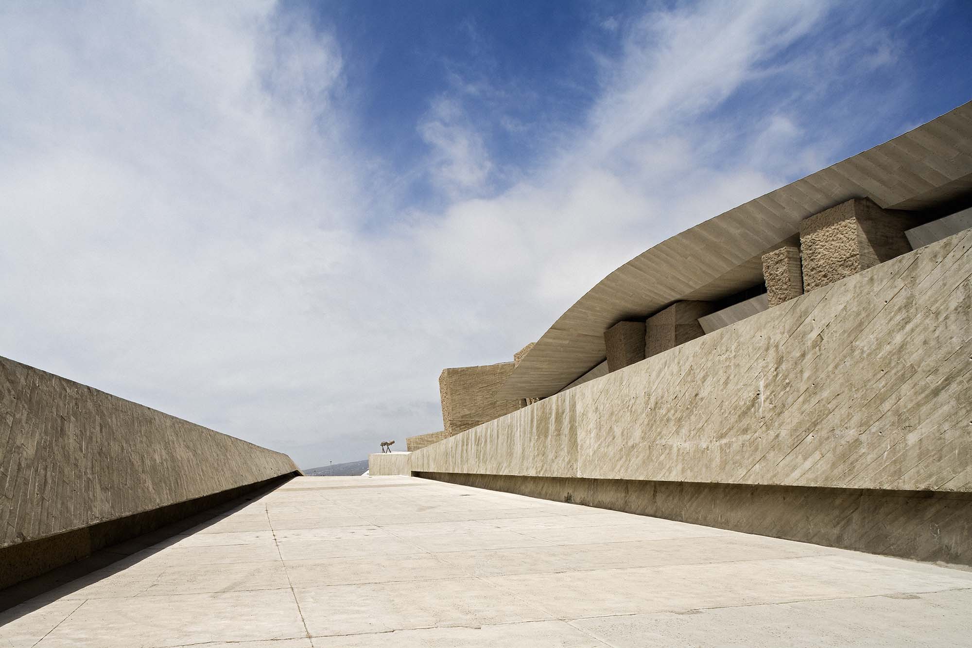
The desert sands of southern Tenerife are the site of an unusual congress centre: MAGMA, the work of local architect Fernando Menis, comprises concrete cubes which appear to have been hewn from the island’s cliffs of lava, and a corrugated roof made of fibre cement panels. Light infiltrates the interior of the building through narrow gaps in the walls and roofs.
Text by Jacob Schoof
Photos by Torben Eskerod
The southeast of Tenerife Island is a barren land – a semi–desert shielded by the volcano Teide (at 3718 metres the highest peak on Spanish territory), whose sparse vegetation rather betrays the close proximity to Northern Africa than to the distant mother country. If it was not for the booming tourism, one would have very little reason to suspect the existence of larger human agglomerations here – let alone one of the most important public buildings to be built on the island for the last decades. The 30 million Euro project MAGMA was originally planned as a pure congress centre, but during the planning phase the brief was extended to include theatre and concert facilities as well – finally a complete auditorium was added. In the future the building is to host regular concerts by the Orquestra Sinfonica de Tenerife, which so far mainly performs in the auditorium of the island’s capital Santa Cruz that was designed by Santiago Calatrava and opened in 2003.
Last not least, due to its good traffic location MAGMA is expected to become a focal point for Southern Tenerife’s economical and cultural development: the motorway bound for Santa Cruz runs directly behind the building. The site was partially excavated out of the slope; facing towards the sea it forms a raised platform with a number of ramps running up to it.
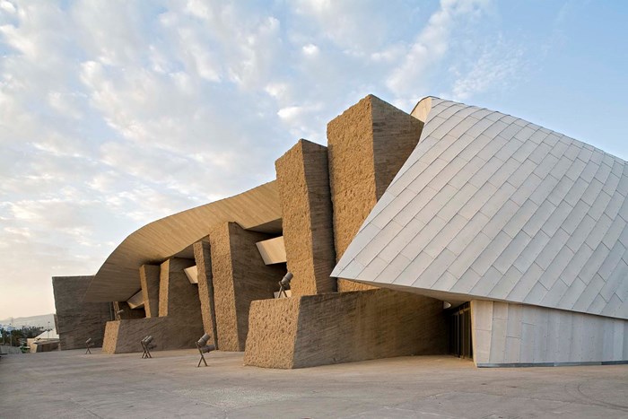
At first glance, the congress centre situated above the town of Adeje curiously both draws on elements of international expressionism and a certain classic, tectonic heaviness, which the Spanish architecture of recent years has rediscovered. Fernando Martin Menis is well aware of this ambiguity of his design: He writes: ‘From a distant point of view, the building presents itself as an arrogant construction in its forms, expressive and strong, while in short distance it dissolves in the territory, blending with the environment.’
Striving to label the unusual new building of Adeje with a common stylistic tag many critics have already likened it to Frank Gehry’s architecture. Just like the Californian in his best buildings, Menis also plays with the tension of solid cubes and undulating roof elements. However, the congress centre lacks the vertical gesture of Gehry’s buildings that reach to the sky; it stays close to the desert sand, thus pleasantly keeping a very down-to-earth profile. Menis compares the solid concrete cubes carrying the roofs to blocks of solidified magma; the undulating roofs themselves symbolise for him a liquid in movement that outlines the space in every direction.
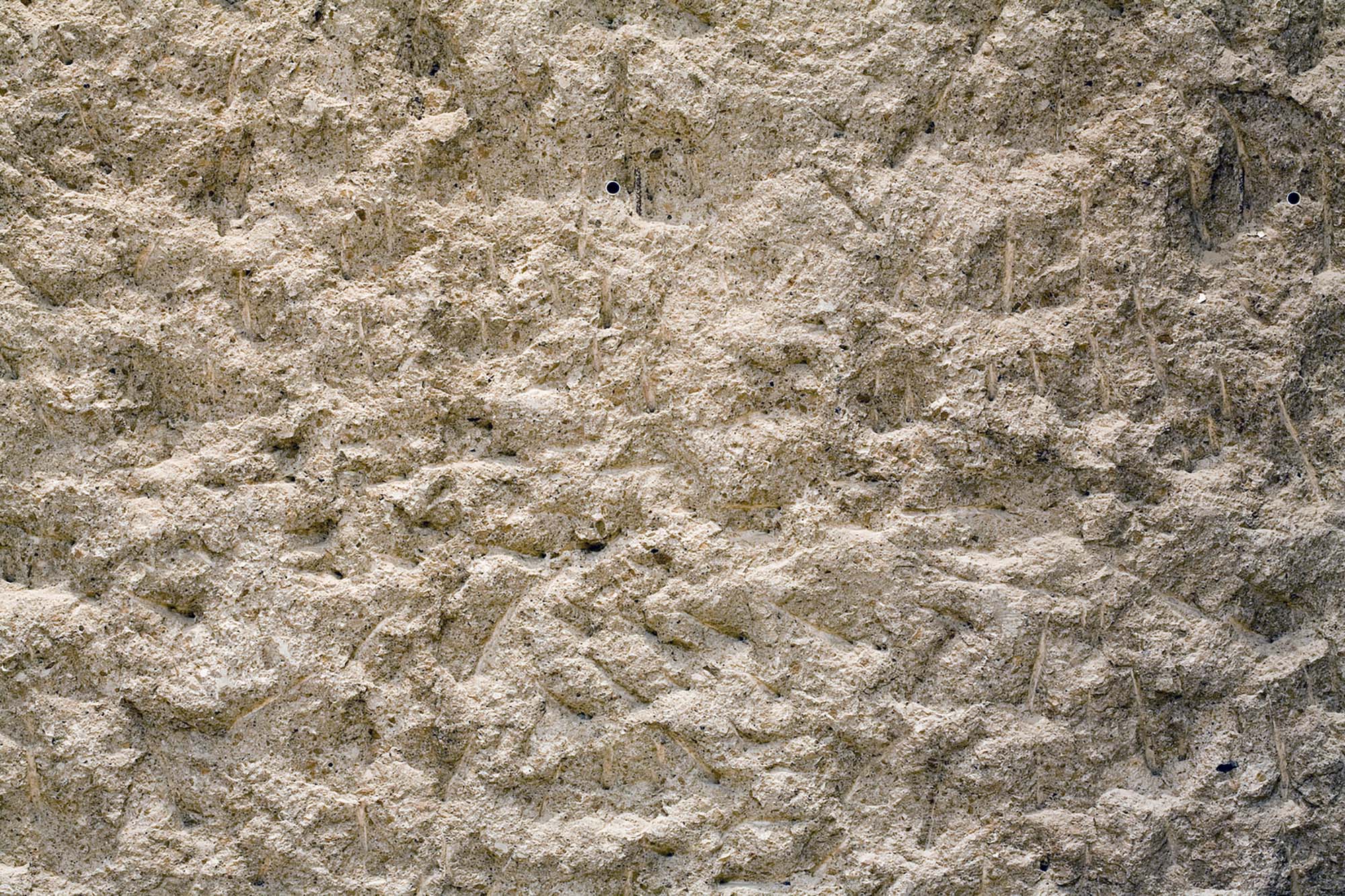
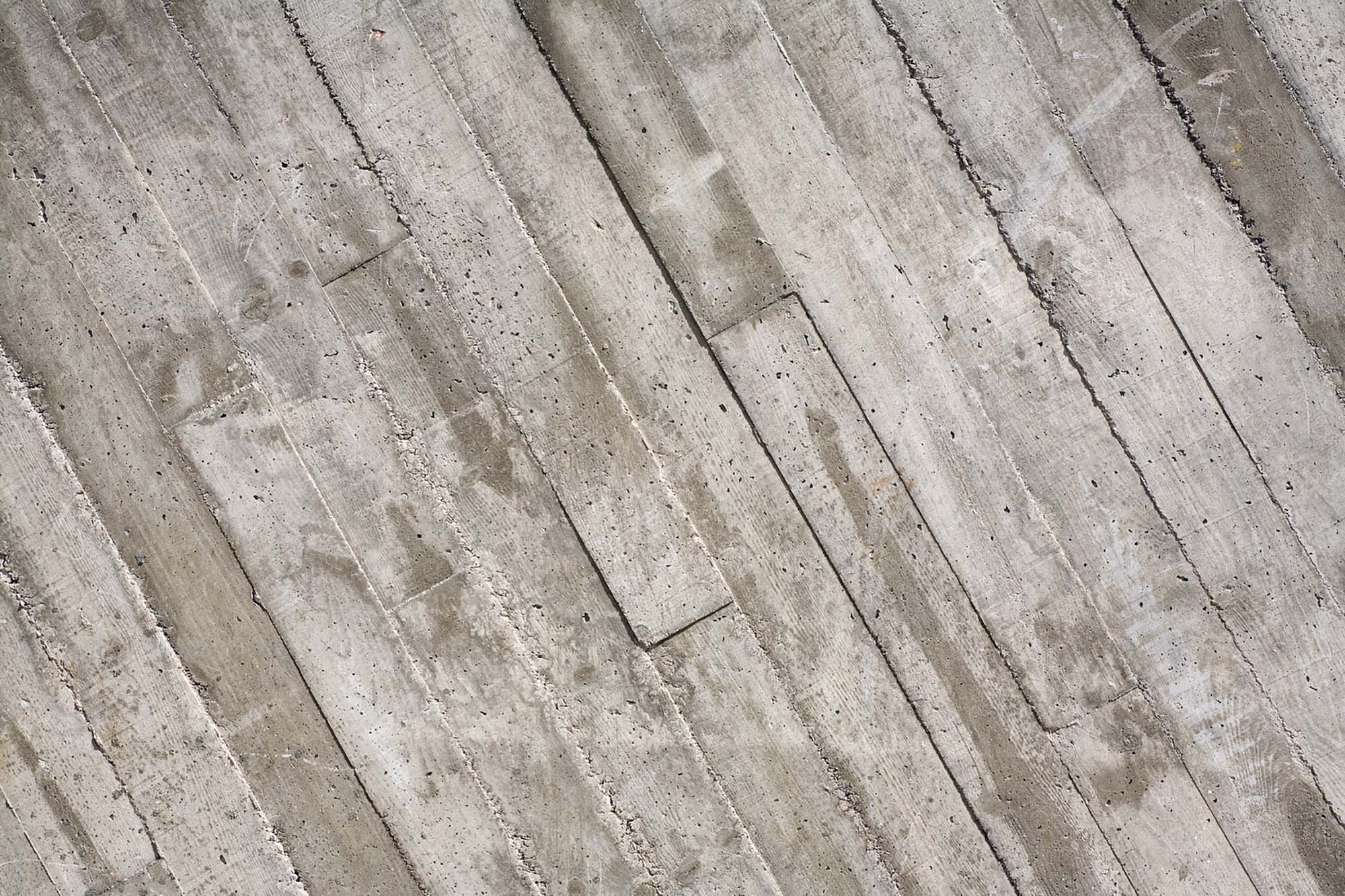
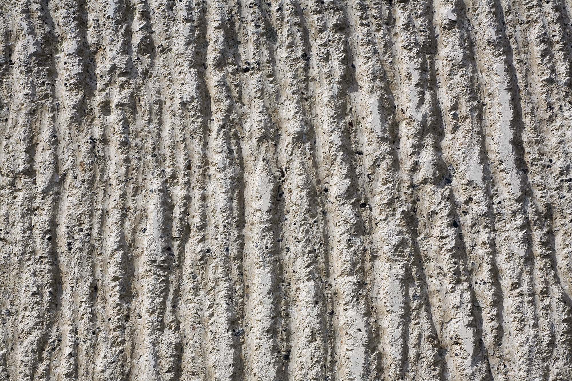
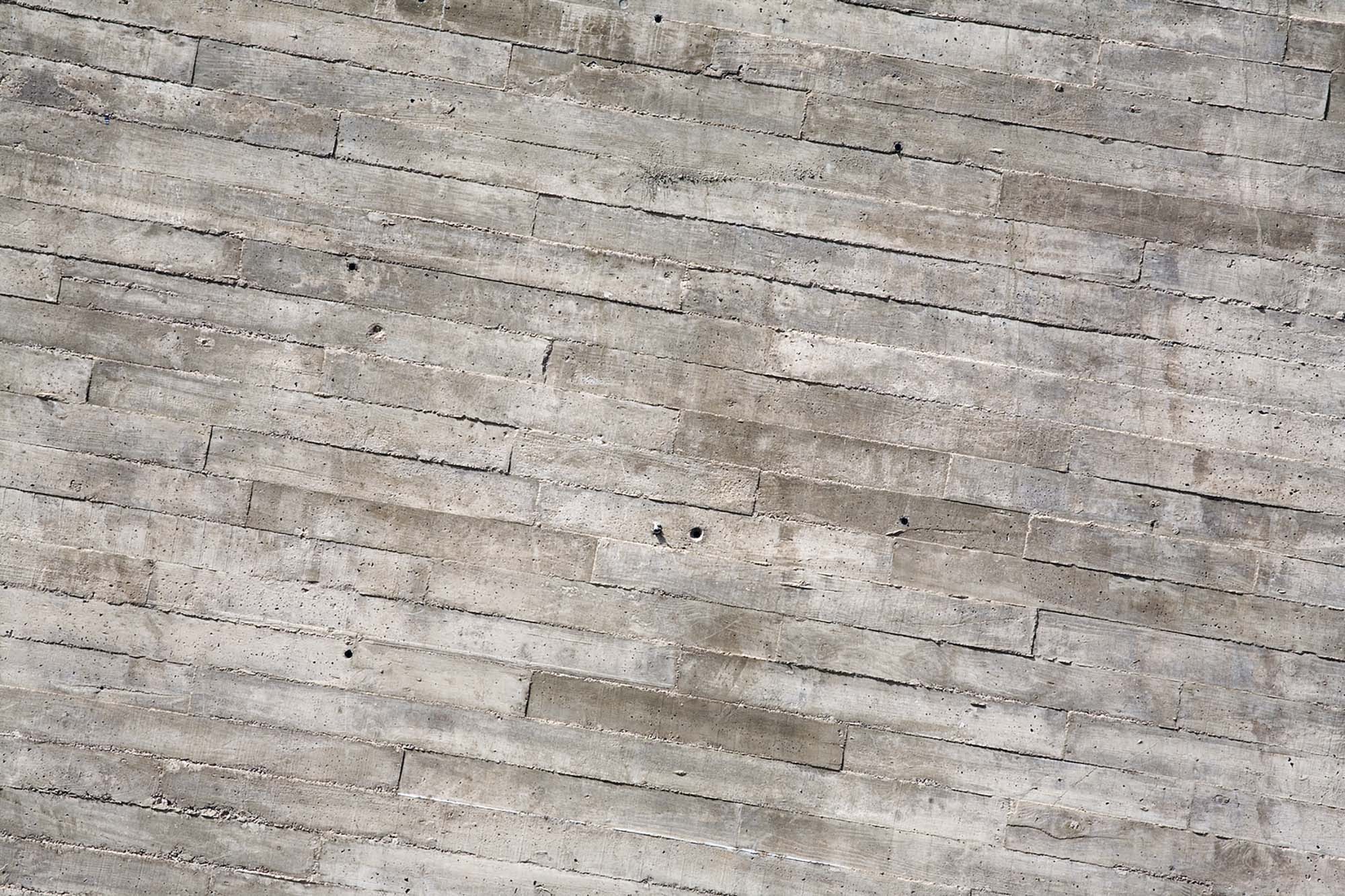
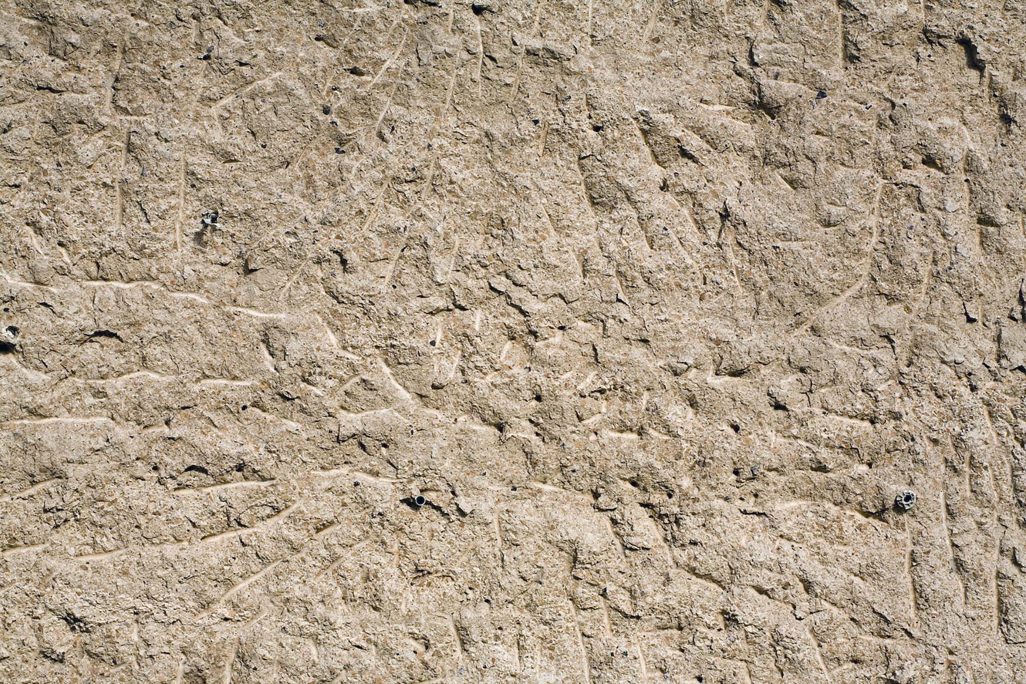
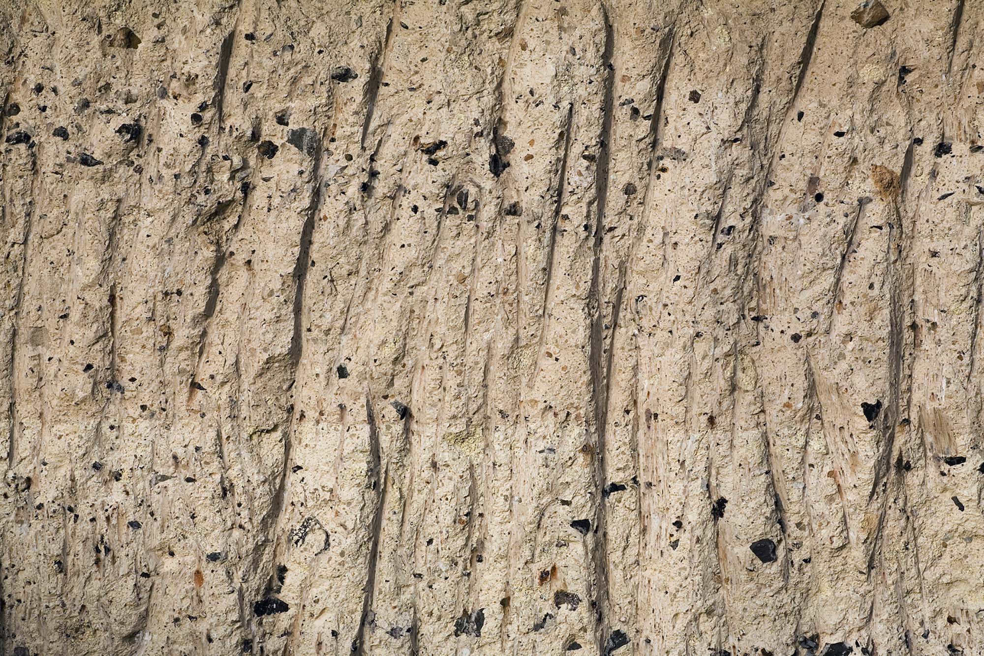
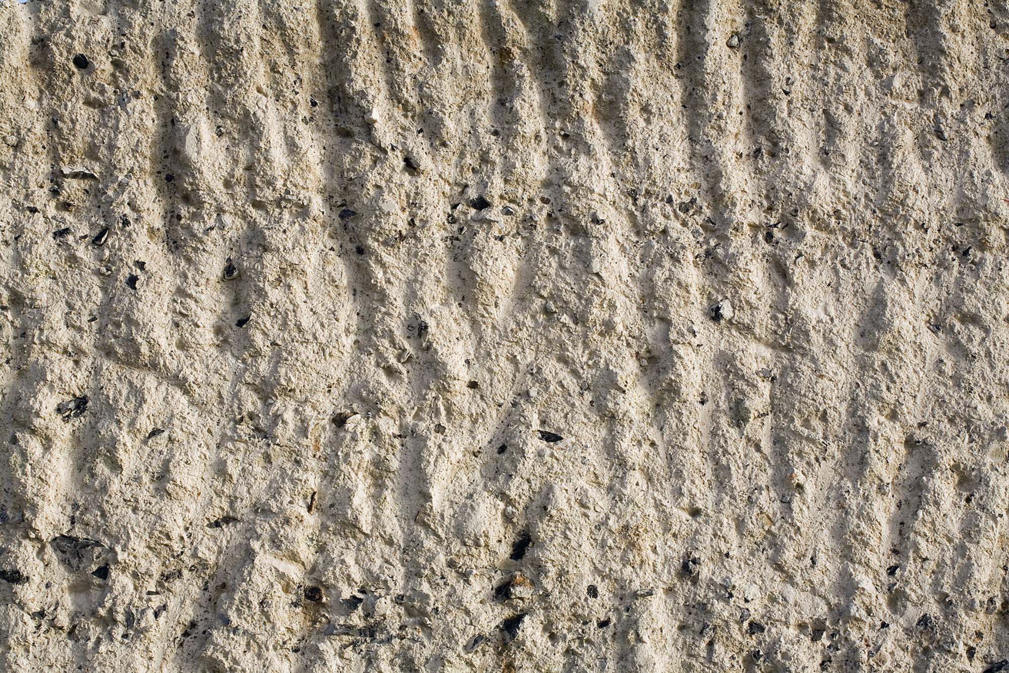
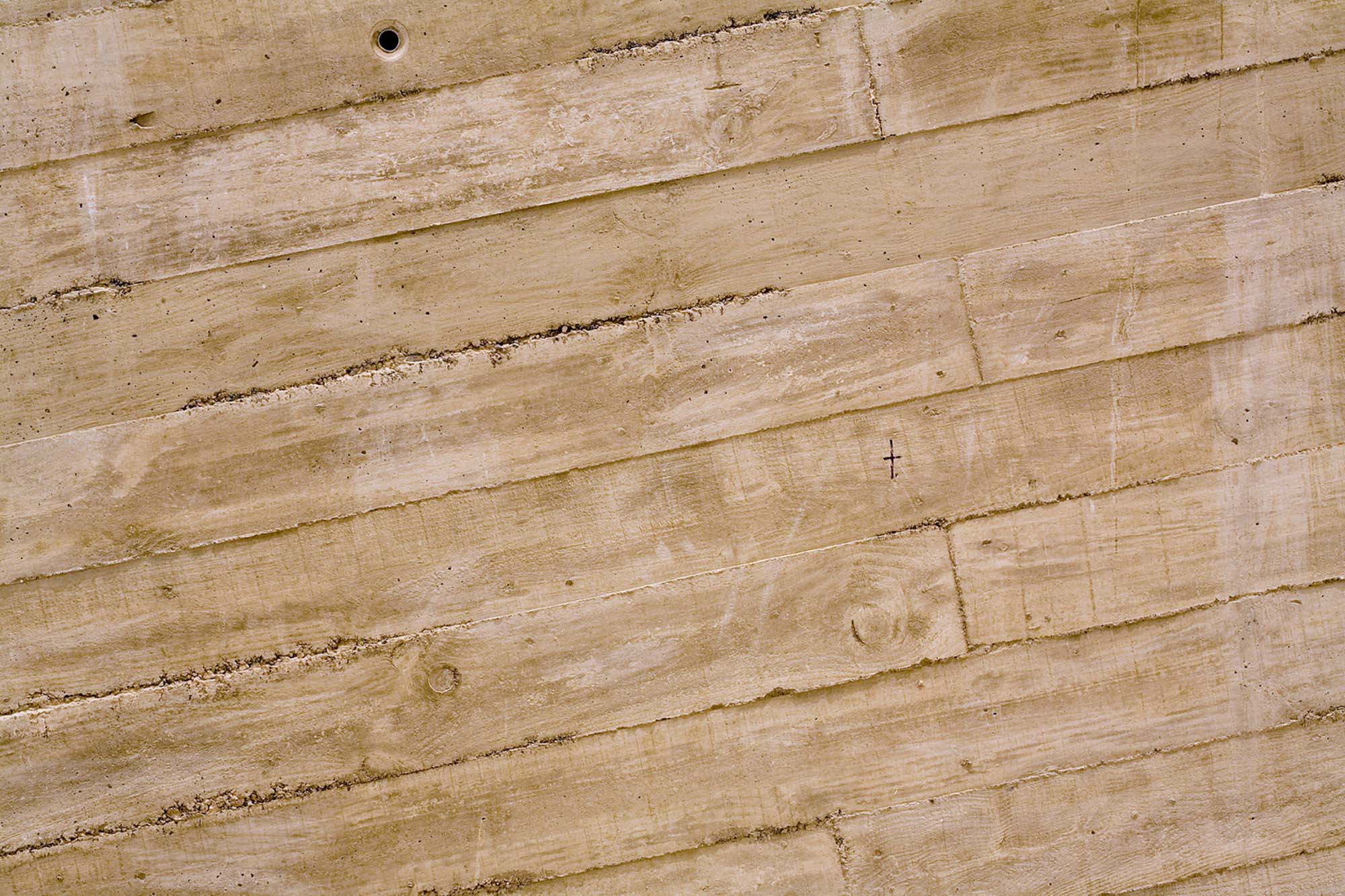
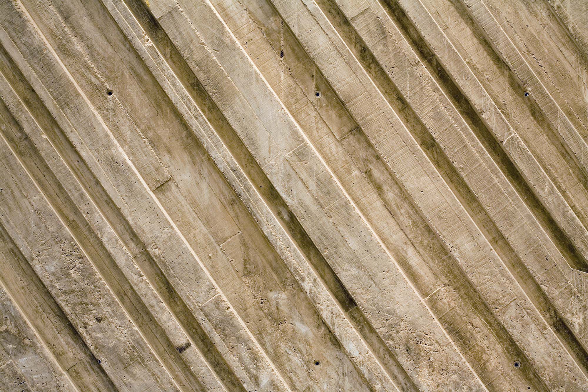
As one approaches the building, the fragmented shape as a whole is broken down into individual building elements with an impressive presence and many contrasting textures. Accordingly, Fernando Menis had all concrete finishes treated in such way so they appear like rough blocks straight from the quarry: while the side facades received a diagonal formwork, which conjures up the image of a pattern left by a gigantic jigsaw, the far ends where subsequently roughened with jackhammers.
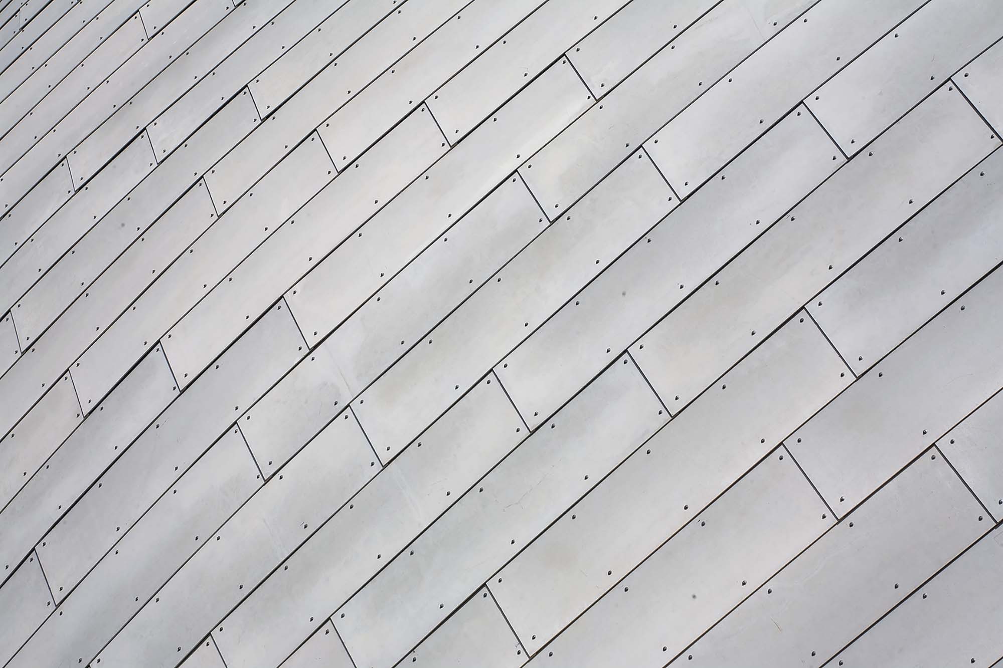
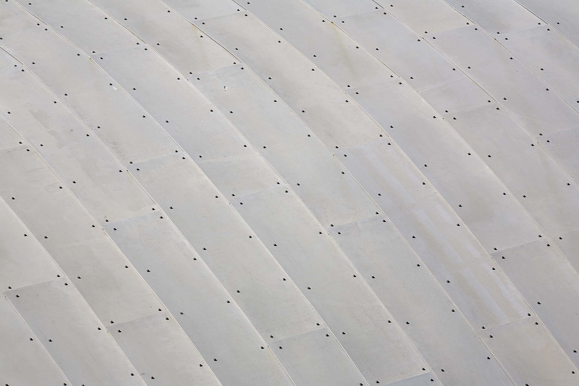
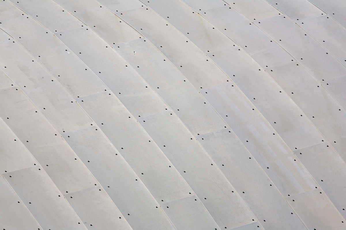
A massive steel lattice with suspended 45cm tall steel girders supporting the ceiling cladding below served Menis as roof structure. The irregular and double-curved roof surface was calculated and manufactured with the CATIA software. It was originally developed for aeroplane engineering and was successfully used on a string of biomorphic building structures during the last years. The undulating roofs are clad internally and externally with flexible fibre cement panels overlapping each other like scales. Even at the edges where the upper and under side of the roof meet Menis strictly avoided any edge profiles in order to sustain the rough, stony appearance of the building. Hence, the roof edges received a jigsaw pattern that harmonizes with the rough chiselled concrete finish. Interior mechanical services such as ventilation and electrical services, the soundproofing and guide rails for the acoustic partitions are concealed within the roof cavity.
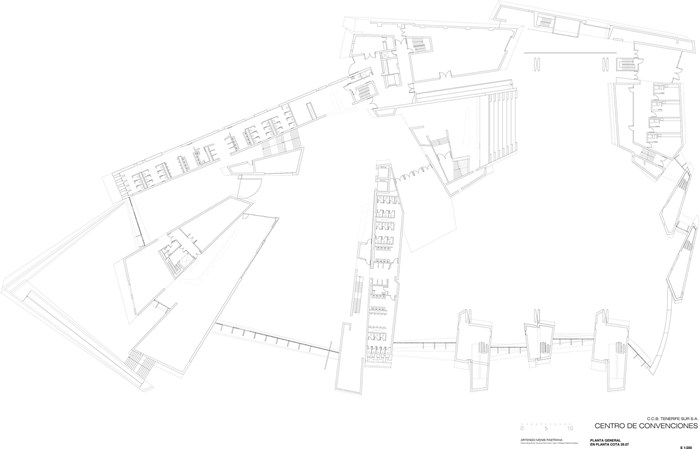
A total of twelve concrete megaliths positioned in a nearly polar array subdivide the building plan, carry the roof loads and contain secondary spaces like WCs, escape stairs, offices and the press centre. The three building entries are located in between. They are equally low-rise and are shaded by sturdy balcony parapets and cantilevered roof segments. The main entrance leads from the forecourt to the foyer space and the adjacent public cafeteria to the left, which is to insure a minimum of public life even on days without conferences. A second entrance leads from the rear of the building to the administrative wing; a third one is only used for large events and leads directly into the auditorium.

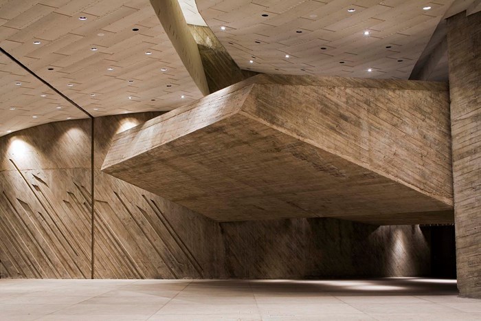
Visitors entering the building with the expectation of a common conference centre with industrial aesthetics, modular steel-glass walls and endless ceiling grids are bound to marvel at the resourcefulness of Fernando Menis’ architecture: with sheer skill he gave the cave-like large spaces not only a special atmosphere, but also a flexibility that lives up to highest international standards. The 2350sqm multi-purpose hall on ground floor that houses a concert stage can also be subdivided into a maximum of nine smaller conference rooms. Also the upper floor can be used either as one 1865sqm conference hall or can be subdivided into a maximum of 26 smaller rooms. This astonishing flexibility of the programme is ensured by sound-insulated sliding walls, which are stored in back-of-house zones (Menis calls them ‘wardrobe rocks’).

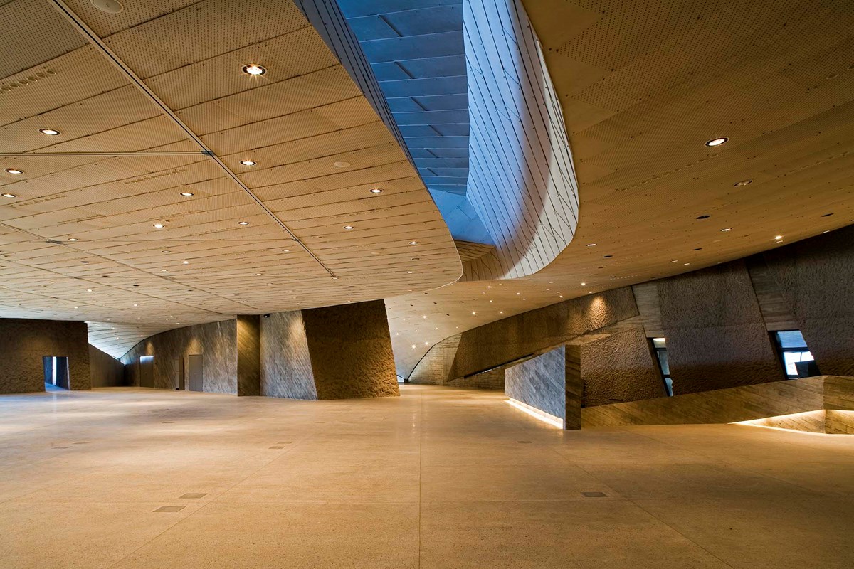
In the entrance hall epitomises all the archaic power of this building: it is low and wide and relatively dark; huge hollow reinforced concrete girders span across the hall at such a low level that occasionally they almost appear to be within reach. The ventilation ducts have been integrated into the girders and the lighting system sits in the deep, dramatic recesses between them. Once again, Menis highlights here the concrete mass by showing the untreated formwork finish at the underside and by chiselling the sides. The adjacent main auditorium with its large ceiling span takes up the full height of the two to four storey building. Numerous recesses and alcoves not only make passing through the building a real sensual experience; they also enable many different uses at once: congress meeting and private conversation, lectures as well as informal social interaction.
Instead of simply fulfilling a programme and catering to every conceivable kind of use the building itself inspires a multitude of activities. The down-to-earth, stubborn architecture is at once functional and artistic: it is rational enough to enable all kinds of activities as well as being a sculptural work of art in its own right that does not depend solely on its use.
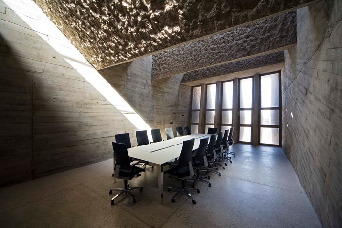
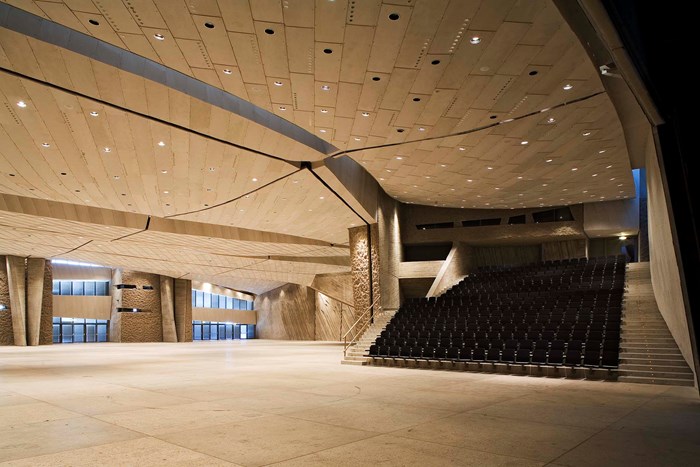
In the best sculptural tradition Fernando Menis makes masterly use of daylight. In southern Tenerife summer daytime highs of 40 degrees Celsius are common and generous direct day lighting of interiors is not advisable. Menis generally lights the spaces indirectly and makes restricted use of direct sunlight to highlight volumes or finishes. Narrow wall and roof light slots (grietas de luz) and circular openings – real ‘light holes’ (agujeros de luz) – are the most frequently use daylight openings in is design. In this respect, the press centre on the upper floor with its repletion of boxed hollow concrete girders and roof strip lights makes for a particular dramatic spatial impression. At night time, powerful halogen floodlights fitted into the ceiling gaps light the building.
Both the final building and the design process followed a sculptural design intention: the first ideas for MAGMA where shaped in a plasticine model hardly bigger than a shoebox; this was followed by larger models out of plasticine and Styrofoam that where then directly translated into architectural drawings. Like the work of a sculptor, Menis’ work flow followed a pattern of a trial and error: only a few details were pre-planned and many things were only drawn, redrawn and then changed again when the project was already on site. For such a geometrically complex building with such an abundance of details like MAGMA an extremely close involvement of the architect in the building process is probably an absolute must. In this particular case the building was only made possible by a totally loyal construction team that followed the many twists and turns of Menis’ ideas nearly without condition.

Client: Canarias Congress Bureau Tenerife Sur S.A.
Architect: Artengo Menis Pastrana, Santa Cruz de Tenerife (Project architect: Fernando Martin Menis)
Location: Costa Adeje, Tenerife (Date of completion: Autumn 2005)
Fernando Martin Menis
My home – which has had a decisive influence on my work – is the Canary Islands. Because of its particular geographical position with its large distance between Europe and America and the closeness to Africa, the archipelago forms an excellent cultural and economic connecting link between the three continents. The volcanic origin and the prevailing light conditions, colours and shapes account for the typical character of the islands which are surrounded by the Atlantic.
These unique, natural conditions for their part influence the architecture, which does not submit to zeitgeist or short-term trends. When carrying out my projects – which try to capture at least a part of this uniqueness – I collect and analyse the materials which are characteristic for a building location. This approach has affected my architecture for many years. The design of a project partly on location has the doubtless advantage that examples can be produced on a 1:1 scale, allowing us to make changes in colour shades or discover unknown textures for certain materials.
The site of the future building is thus also integrated into the project in this way. Because the materials used depend on the surroundings. Independent of the outline of the building, what the facade will look like or how the building is to be divided up, I always choose the most suitable materials in my architecture, which are not only aesthetic, but also harmonize with the environment of the building. The appearance, the colour and the texture are the showpiece of a building.
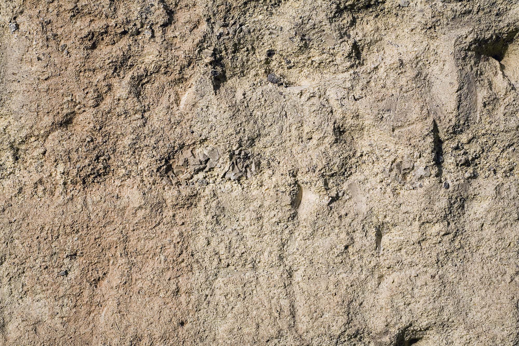
The art and congress centre MAGMA Arte & Congresos on Tenerife, for example, uses flowing lines to express itself, which start at the ground and continue over the walls to the wave-shaped roof, which sits enthroned above everything and gives the building a self-contained feeling. The dominating material is concrete, as this harmonises well with the hinterland and the desert-like landscape of the south of the island. In order to help match the concrete colour more to the landscape, brittle stone originating from local quarries, which is typical for this region, was added and is responsible for providing the ochre colour. The external texture of the building is a reminder of the eroding landscape of the south; it also gives the building vitality, depending upon the day-light. The light thus underlines the texture of the building from outside. In the interior, on the other hand, light is used in another way: It gushes in cascades over the floor and walls and gives rise to a diversified play between light and shade.
