Project Description
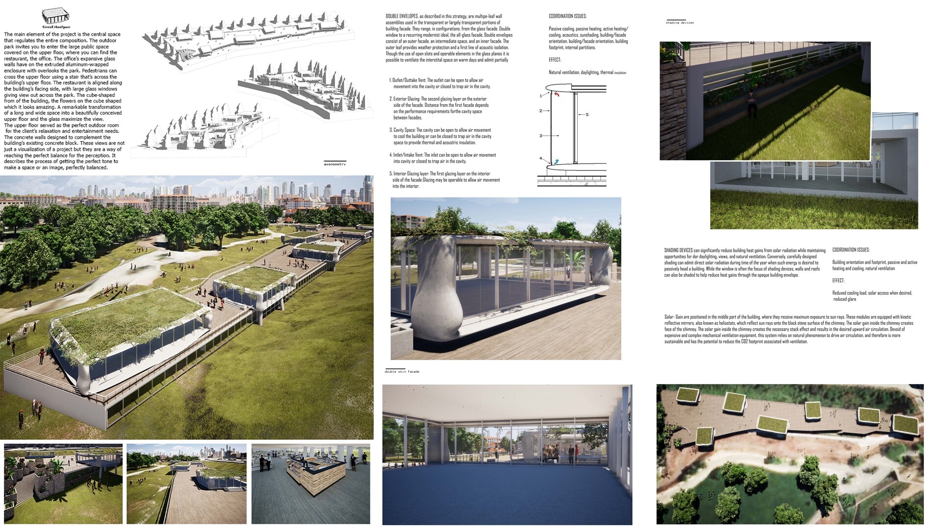
The building has 190m long, 45m wide and 6m height. The project is the central space that regulates the entire composition. The outdoor park invites you to enter the large public space covered on the upper floor, where you can find the restaurant, the office, or open-air festival. The office’s expansive glass walls have on the extruded aluminum-wrapped enclosure with overlooks the park. Pedestrians can cross the upper floor using a stair that’s across the building’s upper floor. The restaurant is aligned along the building’s facing side, with large glass windows giving a view out across the park. The cube-shaped from of the building, the flowers on the cube-shaped which looks amazing. A remarkable transformation of a long and wide space into a beautifully conceived upper floor and the glass maximize the view. The upper floor served as the perfect outdoor room for the client’s relaxation and entertainment needs. The concrete walls designed to complement the building’s existing concrete block. The project develops around the intention of creating a restaurant, office, a public place with free access even to those rooms. It was intended to respect both the outdoor space and the building’s offices by transforming parts of the roof into privileged points of view on the site; the staging plans become terraces with a square function where people can stop and interact with each other. This allowed the use of the area throughout the day giving the community a place that was previously undefined. The functions are contained below the roof-square; large windows allow the most exposed environments to enjoy an excellent level of brightness while those in the shade, covered auditorium, are protected from the outside. The intervention proposes a system in which a building for culture becomes a regeneration suit on an urban scale. In addition, the concept of the proposal is to imagine an outdoor space where people are able to interact at any time of the day. An outdoor space where you can have the opportunity to bring your own instrument and play, a fluid space where rooms interact with the external environment. The visitors inward; all the routes maintain a constant relationship with the outside where the public park at the service of street musicians can become the stage for spontaneous events. Solar- Gain is positioned in the middle part of the building, where they receive maximum exposure to sun rays. These modules are equipped with kinetic reflective mirrors, also known as heliostats, which reflect sun rays onto the black stone surface of the chimney. The solar gain inside the chimney creates the face of the chimney. The solar gain inside the chimney creates the necessary stack effect and results in the desired upward air circulation. Devoid of expensive and complex mechanical ventilation equipment, this system relies on the natural phenomenon to drive air circulation, and therefore is more sustainable and has the potential to reduce the CO2 footprint associated with ventilation. The offices’ green roof (also known as a rooftop garden ) is a vegetative of various kinds, which not only help to adjust air oxygen levels and balance the micro-climate of the offices but also provide attractive and healthy public areas to serve the wellbeing of the offices' occupant and improve the daylighting of the inner chimney atrium. These views are not just a visualization of a project but they are a way of reaching the perfect balance for the perception. It describes the process of getting the perfect tone to make a space or an image, perfectly balanced. Doing so means testing in the first steps a lot of different light conditions. We do it by testing skies, shadows, sun positions, etc... The way the light touches a building is one of the key points of a nice image. The atmosphere refers a lot to the theme of colors and tones. A big part of our research in Architecture is about this topic and about the different perceptions that specific color, texture, or material could provoke to our bodies. By using Twinmotion, photoshop, or basic material rendering techniques we first test this world with a lot of options, to understand the right way to get what we want. These images are all very beautiful and interesting but we just didn’t feel it the right way to show our personal way of doing architecture. We decided to start testing used materials trying to imagine how that material will react to light, clouds and sun during the passing of time. No one of our images has a perfect new material on it because we have always been more interested in testing how time will get an impact on our buildings. The part of research and testing is always the most important one. Many thanks, Suffian Abdussalam
